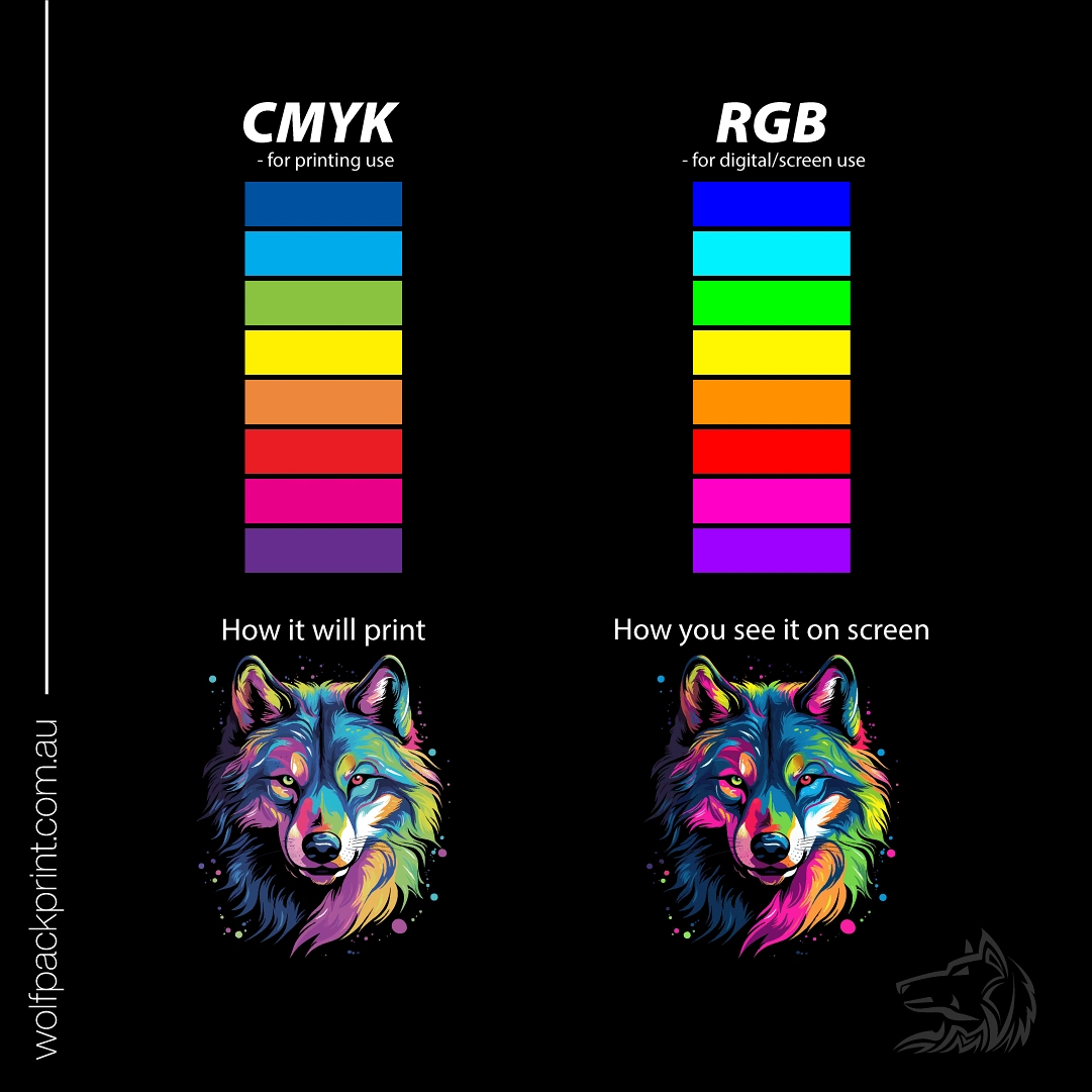
Choose your colour in CMYK RGB GRAY SCALE
What do my colours mean ?

HEX
Hexadecimal
HEX code is the key to unlock web and digital design like HTML, CSS and SCSS. Colours are represented in a 6 number and/or letters combination. For example, black is #000000 and white is #ffffff

RGB
Red, Green, Blue
RGB is also for digital use including television. For this format, RGB combines red, green and blue to create a spectrum of colours. For this format, black is 0,0,0 and white is 256,256,256

CMYK
Cyan, Magenta, Yellow, Key
For print use, CMYK is ideal. Tiny dots of cyan, magenta, yellow and black are overlapped to blend colours. Because of limitations with a printer, not all colours can be produced. Black is represented as 0,0,0,100 and white is 0,0,0,0. For an even richer black, cyan, yellow and magenta can be added to 100% black, resulting in 20,20,20,100

PMS
Pantone Matching System
Recognisably referred as Pantone or Spot Colours, PMS is used for print and textile production. There are variations of Pantone depending on whether the paper is glossy or coated (Pantone C) and uncoated (Pantone U). In standard Pantone, black is “PANTONE Black C”. A pure white is non-existent as the creator assumes the image is printed on white paper

Note that most file types only support RGB. For a file to be ‘print-ready’ (requiring no adjustments before sending it to the printer), it has to be in PDF format using a CMYK profile. More information can be found here about file types
So you got something printed… and you’re thinking…
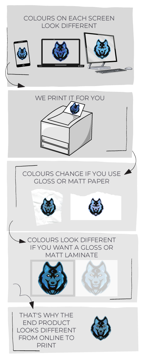
Why do the printed colours look different from online?
-
Printer Variability: Different printers will produce varying colour outputs due to technology differences (inkjet vs. laser), maintenance, and age.
-
Paper Types: The choice of paper will effect colour appearance—glossy papers enhance vibrancy, while matte finishes can soften hues.
-
Importance of using (industry standard) PMS Colours:
-
Exact Colour Matching: Using PMS colours ensure consistency across various printers and materials, crucial for branding.
-
Brand Identity: Maintaining uniform colours reinforces professionalism and brand recognition.
-
Predictable Results: PMS provides reliable colour outcomes, reducing unexpected variations.
-
-
Proofing: Always review proofs on the actual paper type to confirm colour accuracy before final printing.
Here is why …

RGB vs. CMYK
RGB (Red, Green, and Blue) used for anything digital. This colour model mixes light to create a wide range of colours on screens. But here’s the thing: the colours you see on your screen might not look exactly the same in print. That’s because CMYK—Cyan, Magenta, Yellow, and Key (Black)—is used for printing. It works by layering inks on paper, and it has a more limited colour range compared to RGB. So, the printed result might look a bit different from what you see on screen.
Pantone Matching System (PMS)
With today’s digital printers PMS isn’t as popular as it once was, but is still important if you want exact colour matching in applications such as branding clothes, letterheads, and sometimes business cards. Pantone, or PMS, is a standardised colour system that uses pre-mixed inks as to acheive the exact colour shades you need, good for company logos or unique hues that are hard to match with CMYK alone. This system ensures your colours stay consistent across different prints.
Colour Conversion and Matching
When you’re converting from RGB to CMYK, there’s usually a shift in colour. This is because the colour ranges for screens and print are different. To get the closest match, use colour management tools and always carefully proof the designs we send you.
Proofing for Accurate Colours
If colour matching is important to you, request a printed proof. It gives you a preview of your print colours before the final print run. Always check these proofs to ensure that what you see on screen matches what you’ll get in the final product.
Preparing Your Files
Print ready files should always be saved in PDF format with a CMYK profile. This ensures your colours come out right when printed. Also, keep your resolution high (300 DPI) and include bleed areas to avoid any surprises. (Learn more about image file types)
Quick Tips
- Convert Early: Change RGB colours to CMYK early on to see how they’ll really look in print.
- Use Pantone: For colours that need to be exact, go with Pantone.
- Proof Carefully: Always review proofs to confirm how it will print before finalising everything.
By keeping these points in mind, you’ll get print colours that match your vision, whether it’s for colour brochure printing or any other print project. Learn more about printing specifications.
